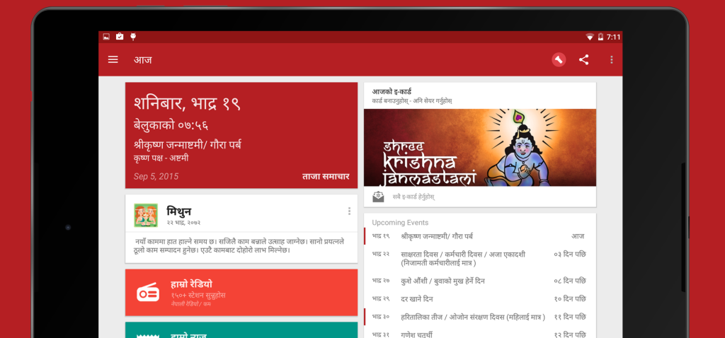
Hamro Patro, one of the largest populated Nepali mobile app has refreshed its Look and Feel today. It has reinvented its website with Google’s new Material Design to make it look more elegant, more user friendly and more vibrant. Users now can use features of the Hamro Patro at their ease.
Hamro Patro says that this is their biggest update and, are very pleased to announce this update for the Android app too. They had been working very hard for couple of months to bring the best version of Hamro Patro ever.
In this new update, the application has brought all its 15 features information to the home screen as a feed of information card to facilitate the users to get the most out of Hamro Patro.
Hamro Patro has appended some fresh features and some enhancements to existing features. Hamro patra used to provide only the event date in the past. But now onwards, you can get the details of the important events and festivals. Hamro Patro has drastically reduced the time lapse to load the images with new image loading techniques which will cost less bandwidth.
To get more details of today’s update of Hamro Patro, you can read an article published by Hamro Patro on their official blog. They have included all the information’s about the new features they have added today.
-
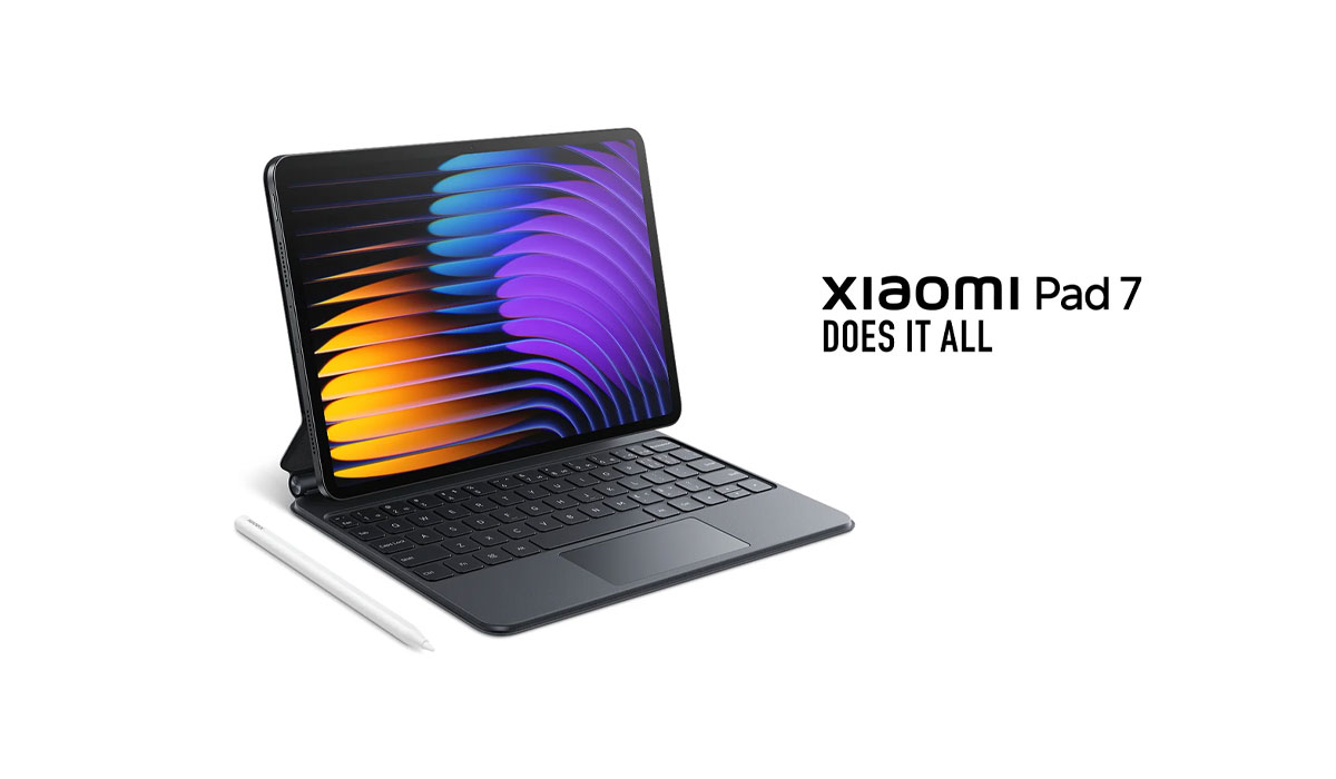
Xiaomi Pad 7 Launching in Nepal Soon: Best iPad Alternative?HIGHLIGHTS Xiaomi Pad 7 price in Nepal could be Rs. 44,999 (8/128GB) and Rs. 49,999…
-
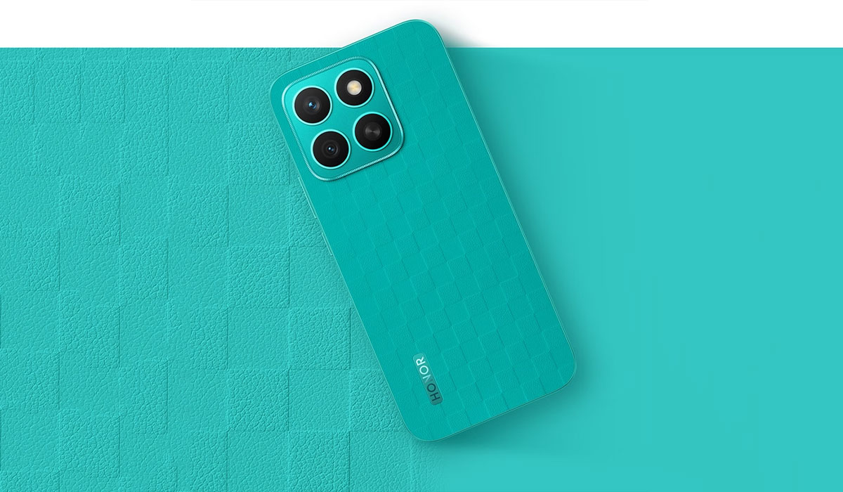
Honor X8c with 120Hz Display Launched in Nepal with an Early Bird OfferHIGHLIGHTS Honor X8c price in Nepal is Rs. 33,999 (8/512GB). It is powered by the…
-
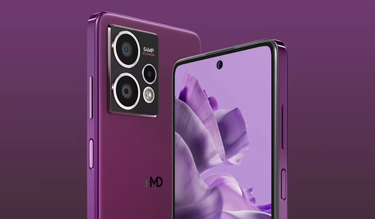
HMD Crest Max 5G Launching Soon in Nepal – Now Even BetterHIGHLIGHTS HMD Crest Max 5G price in Nepal could be Rs. 21,999 (8/256GB). This phone…


